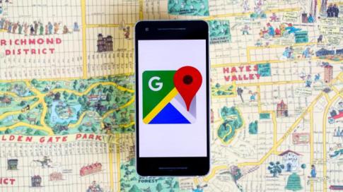
Google on Friday announced the rollout of the COVID-19 layer in Google Maps, a new feature that provides critical information about COVID-19 cases.
The COVID layer shows a seven-day average of new detected COVID-19 cases per 100,000 people in an area and a label that indicates whether the cases are trending upwards or downwards.
This information enables Google Maps users to make informed decisions and stay safe while moving around. The COVID layer starts rolling out worldwide on Android and iOS this week.
“More than one billion people turn to Google Maps for essential information about how to get from place to place–especially during the pandemic when safety concerns are top of mind. Google has developed features that will ensure users stay safe when out and about” Agnes Gathaiya, the Country Director for Google Kenya & East Africa said in a press statement.
“The COVID layer is designed to aid users in making informed decisions about where to go and what to do to stay safe as they navigate,” she added.
Data featured in the COVID-19 layer comes from multiple authoritative sources, including Johns Hopkins and the New York Times.
These sources get data from public health organizations like the World Health Organisation, government health ministries, local health agencies, and hospitals.
Many of these sources already power COVID-19 case information in search, and Google is now expanding this data to Google Maps.
The COVID layer is similar to the traffic or satellite layer and can be accessed from the layers button at the top right corner of the Google Maps home screen.
“Tap on the layers button and click on ‘COVID-19 info’ to see the seven-day average of new COVID cases per 100,000 people for the area of the map you are looking at. Information on the upwards or downwards trend of the new cases is visible at the country level for all 220 countries and territories that Google Maps supports, along with state or province, county, and city-level data where available,” the statement read.
According to Ms. Gathaiya, the COVID-19 layer is colour-coded for easy recognition of the density of new cases in an area.
Green refers to 1-10 cases per 100,000 people, yellow 10-20 cases per 100,000 people, orange 20-30 cases per 100,000 people and red 40+ cases per 100,000 people.


Leave a comment