Ever walked into a room and noticed how the colours on the walls, the furniture, and the décor have your emotions tinkering with excitement or drag you down? It’s all about decor design achieved by colours
Well, it has been proven that colour has the psychological ability to make your moods change in just a split second. This is probably the reason colour forms the basis for most interior design and décor works. Right from the floors all the way to the windows and even the lustrous surroundings that build up to the particular feel that has you falling head over heels.
Here are some of the reasons as to why your interior designer will opt for certain colours over others when putting together your home space.
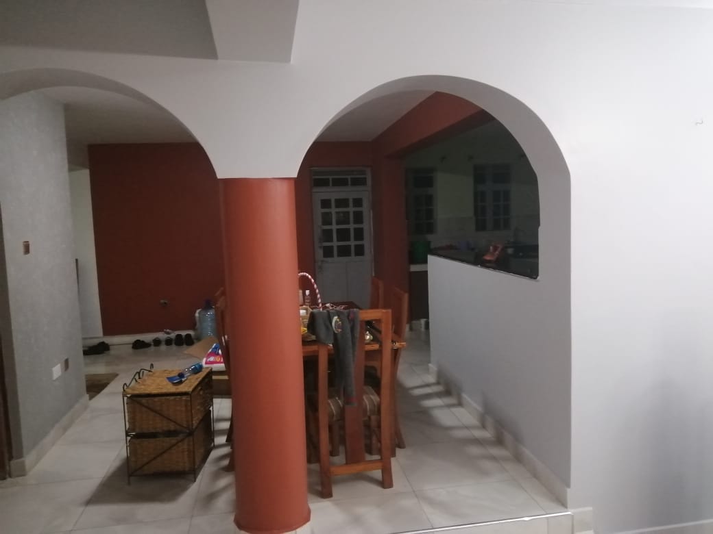
A lighter shade of Brown, for instance, can be often used to create that rustic feel on furniture, floors as well as cupboards among other surfaces in the home or office space. Its contrasting effect to other colours allows for a warm, eco-style and a calming feel. This colour brings class and finery to your space.
Blue is yet another colour that has the ability to create an air of calm and relaxation. Some exciting shades of blue that go well together are turquoise blue and navy blue as well as sky blue and royal blue. If looking to infuse some life into your home, you can definitely include blue hues when it comes to your walls, especially the bathrooms, the adult bedrooms as well as the corridors.
When it comes to using blue for upholstery you should consider purchasing blue rugs and carpets which usually go well with different hues of blue seats, cushions intertwined with hints of white décor pieces, all in a white background.
Unbelievable as it may seem, Blue is not just Blue. Basco Paints has nearly 400 shades of Blue to offer to any discerning housewife for their interior decor
Meaning of Green Colour
Green: If you ever wondered why green plants in homes give you a feeling of peace and calm; this is because many associate green with rejuvenation, restoration as well as healing. It simply allows you to feel secure and safe at the same time without too much effort.
Different shades of green such as emerald green can be best suited for an air of luxury and elegance. So where do you inculcate green in the home? Well, in the entry foyer, the living room but this mainly applies to a hue of neon-lime green, and of course, the bathroom tiles which would do well with jungle green. The colours you can pair green with are shades of red, purple and orange.
Grey, most people view grey as a dull, uninviting colour. However, if used correctly, grey conveys a trendy, fashionable look. Yes, sounds hard to believe but if you pair it with white, green and brown it can bring out the beauty in grey.
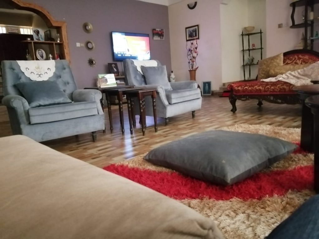
Apart from being trendy, grey gives off a feeling of inclusion, security and acceptance. With that in mind, if you are planning to get some grey to blend in with your interior pieces, you could use it on sofa sets, dining tables, upholstery, rugs and carpets as well as curtains. The trick to inculcate grey during interior decor is to use shades of grey that have hues of yellow or blue!
See Also >> How to Use Bright Colours to Enhance Your Kid’s Intelligence
Red gives off qualities associated with love, excitement, beauty, and happiness. Dependent on your culture, red is synonymous with positive energy, good luck as well as loyalty. Red is that colour you can use in focal points such as a feature wall in the living room without getting weird stares when you have guests over. It can be added onto rugs, carpets, painted furniture especially for the dining table, fabrics for the dining table, curtains and artwork pieces such as lampshades.
The great thing about red is the many variants it comes in such as scarlet, ruby, crimson, garnet, and claret, among others, which you can easily pair with grey, orange, green as well as white.
White is Versatile
White is a colour that goes with just about anything. As much as it alludes to serenity, a pure and sophisticated feel, many do not ascribe to using it solely in their interior décor. White is often used to accentuate features on other interior pieces such as furniture and upholstery.
The good thing about white is its versatility meaning it can be used just about anywhere, especially in the variant shades, soft white floors, walls, curtains, rugs, cupboards, and even window frames to give off an elegant feel. The best undertones of white in interior décor would have to be the chalky and ivory shades which perfectly contrast with just about anything on the colour spectrum.
Black: When you think black, an air of darkness, moodiness comes into play. However, if used wisely in a room with natural light, black can be transformed to create a contrast to the rest of the room. Black is best used in small intimate spaces. Some spaces that allow for black to be used are window frames, doors, and staircases.
‘if used correctly, grey conveys a trendy, fashionable look.’
Kamlesh Shah, MD, Basco Paints
When it comes to furnishings, a black curtain, a black rug, a black dining table as well as a black cushion are all signature statements you can make when it comes to designing your space. Black, used properly, gives out an air of bold sophistication.
Orange: Given its vivid vibrant nature and saturation as well as richness, is that go-to colour if you are looking to create an optimistic feel, a happy and playful vibe. Orange is a colour you can splurge on your walls, furniture as well as art décor not forgetting curtains and rugs.

When using orange be careful not to overdo it as it is already loud. Orange is best suited for focal points such as receptions, living rooms, and even the kitchen space.
There can be an endless dialogue, as can be seen from the examples above, surrounding colours and their usage. Try watching a black and white movie in these times, and you will see what I mean.
Colour is such a strong statement at all times, yet all too often taken for granted.
Next Read >> Self Taught Interior Designer With a Magic Touch


Leave a comment